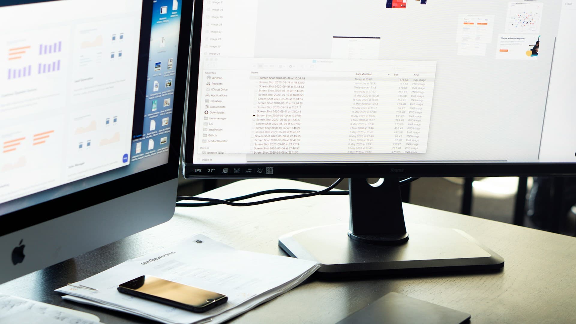
Sometimes plans shift fast. New updates pop up, priorities change, and it can feel like everything demands attention at once. When that happens, the last thing we need is a slow report or a scattered list of numbers. What helps us move with more clarity is having the right view in front of us, right when we need it.
That’s where a real time analytics dashboard comes in. Instead of flipping between files and waiting on updates, teams can see what matters most, all pulled into one place. We don’t guess. We act.
Whether it’s wrapping the year or starting a busy stretch, a strong dashboard setup can keep things steady, even when everything else moves quickly. Here are some ways we make the most of ours.
Staying Focused When Everything Feels Urgent
When everything feels like a priority, it’s easy to lose track of what really needs attention. A dashboard helps cut through that. Instead of flooding the screen with every metric we’ve ever tracked, we highlight what matters right now.
• Show only top metrics for the day, week, or current phase of a project
• Keep the view simple, think color coding, clean labels, and quick markers
• Use visuals that help anyone make sense of the data at a glance
The goal isn’t to share everything. It’s to share just enough so teams know where to focus and what calls to make next. That kind of clarity keeps decision-making quick and steady, without adding pressure.
Anlytic’s real time dashboards offer drag-and-drop customization, so teams can highlight only the metrics or KPIs that matter most in a busy week.
A well-designed dashboard makes work feel manageable, even during high-pressure moments. Instead of pausing to figure out priorities, teams can trust the dashboard to display the essentials. With a focused view, distractions are minimized and effort can be put exactly where it matters. That’s why revisiting the setup regularly and making small adjustments keeps teams sharp.
Letting Teams Spot Problems Early
Fast-moving periods make it easier to miss the little things. A slight delay can snowball. One skipped step can throw everything off. That’s why our dashboards are built to give us an early heads-up.
• Live updates help us notice dips, gaps, or spikes in real time
• Simple highlights flag things that fall outside the usual range
• We keep the language easy to follow so anyone, not just data teams, can act on what they see
When information shows up clearly and quickly, we don’t fall behind waiting for answers. It’s not just about fixing issues, it’s about catching them before they turn into real problems.
Our AI Command Centre enables alerts and automated signals, turning raw data streams into actionable notifications, so nothing falls through the cracks, no matter how busy things get.
By noticing trends early, we can react before minor issues have a chance to get out of hand. Teams benefit from an early warning system that is simple, direct, and visible to everyone involved. This means that even when responsibilities are divided or staff are out of the office, the project continues to progress smoothly. The combination of live updates and visible cues keeps tasks from falling silently into the background.
How to Keep Everyone on the Same Page
When goals shift or new info comes in, getting everyone aligned can feel like a full-time job. Long chats or constant status meetings can take time we don’t have. That’s where our dashboards step in.
• Real time updates show progress, delays, or task swaps between teams
• Shared views by role let everyone see what’s relevant without confusion
• One quick look tells people what’s done, what’s underway, and what still needs attention
This cuts back on long threads, missed messages, and confusion about timelines. Instead of checking in across three platforms, the whole group sees one current version of the story.
By giving each department or user a tailored view in Anlytic, everyone can track updates without sifting through metrics that don’t apply to their work.
Shared dashboards lead to far fewer misunderstandings, especially when multiple departments interact or a project requires coordination across several roles. When the big picture includes each team’s current status, it’s easier to spot dependencies and avoid duplicated efforts. This prevents confusion over next steps, missed transitions, or doubled work. In complex organizations, the advantage of always viewing the most recent information can’t be overstated.
Picking the Right Dashboard Elements for Fast-Moving Teams
A good dashboard doesn’t have to be big. It just has to work.
We choose a few core metrics that give us clear answers. Then we keep the display neat so we don’t waste time hunting for the right info.
• Use direct numbers like task count, response time, or percent-to-goal
• Keep the layout consistent with easy spacing and grouping
• Refresh data often, automatically if we can, to stay current
The faster we move, the more we rely on these tools to give us direction in the moment. Clean design and clear numbers go a long way when we’re already juggling a lot.
Consistency across the dashboard helps users become familiar with how and where to find updates. When people know exactly what to expect and where, they waste less time searching, and the risk of missing a critical metric drops. Even as specific priorities change from day to day, the underlying dashboard layout should remain user-friendly and stable, creating an anchor during turbulent work periods.
Staying Ready for What’s Next
It’s easy to feel reactive during high-speed stretches. One change after another can push us into survival mode. But with a real time analytics dashboard, we don’t just respond, we stay steady and keep pace.
When dashboards update quickly, we’re not caught off guard. We see change coming, and we adjust before it throws off the whole plan. Whether we’re rolling into holiday prep or launching a new initiative, having one view that adapts with us makes a difference.
Clear, timely insight helps us support each other better and plan smarter, even in the middle of a busy season. We don’t need perfection. We need visibility. And that helps us move forward with confidence, no matter how fast things shift.
A strong dashboard encourages teams to make plans with flexibility in mind, knowing the real-time view will alert them if adjustments are needed. This kind of preparation leads to better project handoffs, more seamless pivots in strategy, and less scrambling if resources shift. Everyone gets used to relying on up-to-date numbers, so stress is reduced and decisions become more thoughtful.
When your team is working through shifting priorities or busy holiday sprints, having a clear view of what’s happening in the moment can make a real difference. We’ve designed our process to be straightforward and visual by relying on a real time analytics dashboard that helps us stay focused, adapt quickly, and work with intention. When things accelerate, fast answers and shared visibility lead to fewer surprises and better collaboration. At Anlytic, this is how we help teams keep decision-making on track, no matter how plans change. Interested in seeing this approach in action for your organization? Contact us today.
